Grapevine Olive Oil Company Branding Refresh
Rooted in history. Designed for what's next. A fresh new look for Grapevine Olive Oil Company!
Since 2010, Grapevine Olive Oil Company has been sharing premium olive oils, specialty foods, and thoughtfully curated products with the Grapevine community.
For their refreshed brand identity, we wanted to create something that honored their roots while feeling timeless, refined, and versatile.
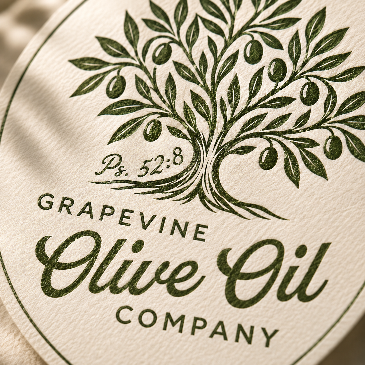
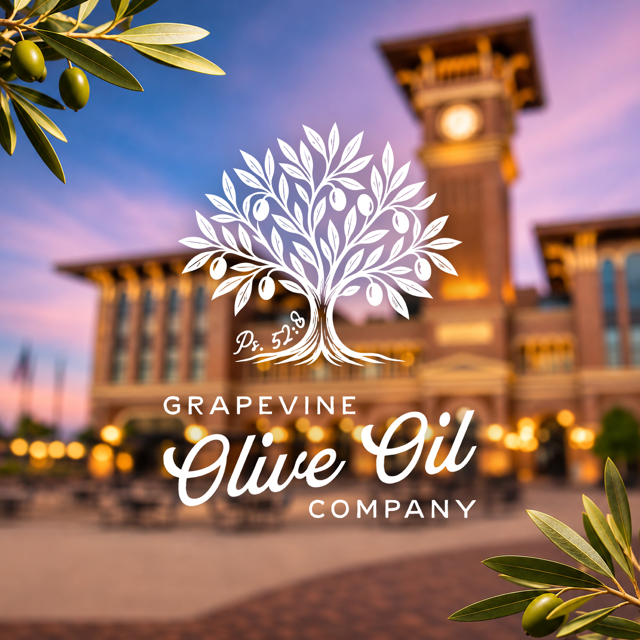
At the heart of the new logo is an olive tree with a meaningful detail: 52 leaves and 8 olives, a subtle reference to Psalm 52:8: “But I am like an olive tree flourishing in the house of God.” A beautiful reminder of growth, strength, and staying rooted in what matters.
The typography pays homage to Grapevine's historic Main Street charm, pairing classic lettering inspired by vintage storefront signage with an elegant, flowing script. An earthy green palette ties everything together, creating a look that feels both established and fresh.
Every detail was designed with intention, connecting the company's history, values, and future.